
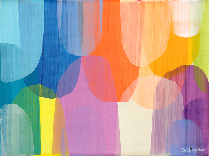
As an abstract artist, I've come to understand that color isn't just a visual element; it's a language of emotions, a conduit for expression, and a tool for captivating the viewer's attention. Choosing the right colors for your abstract painting is not merely about selecting hues that look good together; it's about harnessing the innate power of color to evoke feelings and create visual interest. In this guide, I'll share practical tips and techniques to help you master the art of color selection and make your paintings truly pop.

Understand the emotional impact of colors
Before diving into your palette, take a moment to consider the emotional associations of different colors. Red may evoke passion and energy, while blue might convey calmness and serenity. Yellow can bring warmth and happiness, while green may represent growth and harmony. By understanding these emotional triggers, you can intentionally use colors to convey specific moods or messages in your artwork.

Create contrast for visual interest
One of the most effective ways to make your painting stand out is by incorporating contrast. Experiment with juxtaposing complementary colors—those opposite each other on the color wheel—to create vibrant visual tension. For instance, painting a predominantly blue composition with small accents of orange can create a dynamic interplay that draws the viewer's eye and adds depth to your artwork.

Explore monochromatic schemes with accents
Monochromatic doesn't have to mean monotonous. Instead of limiting yourself to a single color, explore the subtle variations within a single hue by using different tones and shades. Then, introduce small accents of a contrasting color to create visual intrigue. For example, a painting dominated by shades of gray can come to life with a pop of vibrant red or yellow, strategically placed to guide the viewer's gaze and add excitement to the composition.

Experiment with tone-on-tone effects
Tone-on-tone painting involves using variations of the same color, from light to dark, to create depth and dimension. This technique is particularly effective for achieving a harmonious, cohesive look in your abstract paintings. By playing with the saturation and intensity of a single hue, you can create subtle shifts in mood and atmosphere without introducing additional colors.

Consider the psychological effects of color proportions
The proportion of different colors in your painting can have a profound impact on its overall mood and energy. For instance, a composition dominated by warm colors like reds and oranges may feel vibrant and energetic, while one with a preponderance of cool blues and greens might exude a sense of tranquility and calm. Experiment with different color proportions to find the perfect balance for your desired emotional effect.

Trust your intuition and embrace experimentation
Ultimately, the key to mastering color in abstract painting is to trust your intuition and embrace experimentation. Don't be afraid to push the boundaries of traditional color theory and explore unconventional combinations. Allow yourself the freedom to play with color, texture, and form until you find the perfect balance that resonates with your artistic vision.
Choosing the right colors for your abstract painting is a nuanced process that goes beyond mere aesthetics. By understanding the emotional impact of colors, experimenting with contrast and tonal variations, and trusting your intuition, you can create artwork that not only pops visually but also resonates deeply with viewers on an emotional level. So go ahead, unleash your creativity, and let your colors speak volumes.
